
Three decor upgrades I use: a matched-frame wall, lamp revamps, and a sheet-music gallery that doesn’t look like a craft fail.
The matching-frame wall without paying matching-frame money
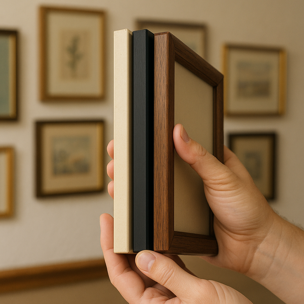
Here is the thing I had to learn the hard way: a gallery wall looks messy for exactly two reasons, and neither one is the art. It’s the mix of frame finishes and the random thicknesses that make it read like you hung whatever you had in the closet. The fix is boring, which is why it works. At the thrift store, I hunt frames by profile, not by color. Give me ten frames that are all about 3/4 inch wide with a simple edge, and I can make them look like they came as a set even if they started out as oak, brass, black plastic, and one suspicious cherry stain from 1997.
My aisle test is quick: I stack two or three candidates edge-to-edge in my hands and look only at the side view. If the depths are roughly similar, they will hang like a family. If one is a chunky shadow box and the next is a skinny poster frame, they will fight each other on the wall no matter how nice the prints are. I also flip them over and check the backing. If it’s crumbly cardboard held together by hopes and one rusty staple, I pass. Replacing glass and hardware can cost more than the frame, and you will hate yourself later when it pops open the first time you dust.
Once home, I pick one finish and commit. For a cohesive look, matte black spray paint is the easiest, but I usually do a softer route: a single can of warm white or mushroom so it blends into the wall and lets the contents do the talking. The part that makes it look expensive is prep, not the paint. I wipe the frame down, lightly scuff glossy spots with fine sandpaper, then do two thin coats. I keep the original paper labels on the back because it’s funny to find them later, and nobody sees them. For the art, I like secondhand book pages, old maps, or even a set of paint chips cut into identical rectangles. It’s not precious, which means I will actually hang it instead of waiting for the perfect print that never shows up.
Lamp redo: swap the shade, not the whole lamp
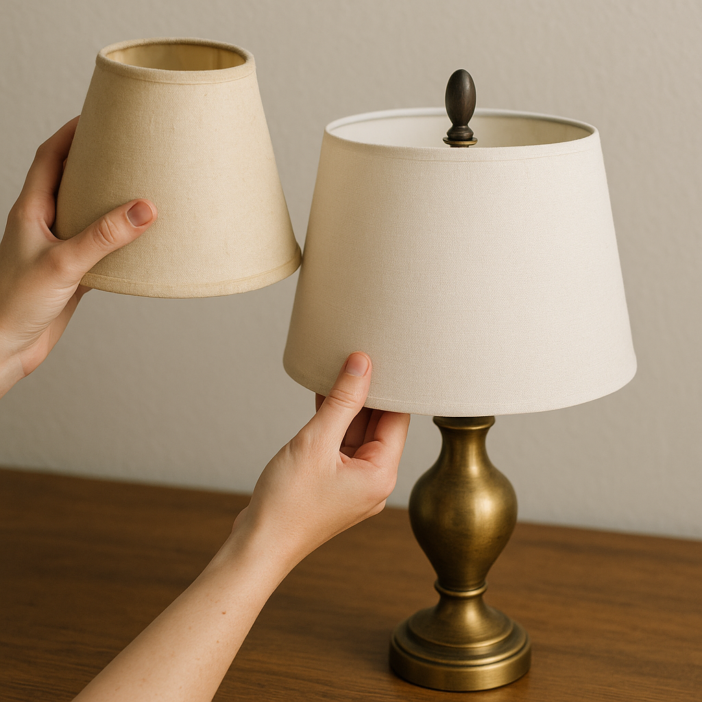
I used to walk right past lamps at Goodwill because half of them look like they belong next to a waterbed. Then I started paying attention to what was making them feel dated, and it’s almost always the shade. The base is usually fine. Heavy, even. Sometimes it’s solid brass or a surprisingly good ceramic shape. It’s the tapered beige shade with the shiny plastic backing that gives it that dentist waiting room vibe.
So now I thrift lamps like this: I check that the lamp stands straight, the socket is tight, and the cord isn’t cracked or taped. If anything electrical looks sketchy, I leave it. A lamp is not the place to be heroic. If it passes the quick sanity check, I buy it for the base and assume the shade is coming off the moment I get home. If the shade is gross but the base is great, I ask myself one question in the aisle: does it use a standard harp and finial? Most do. That matters because replacements are easy. If it’s some weird proprietary clip-on situation, I only grab it if I already have a plan.
At home, I clean the base first. Warm soapy water for ceramic. A damp cloth for metal. If there is grime in the grooves, an old toothbrush gets it without scratching. Then I decide whether the base is getting paint. I do paint lamps sometimes, but I try not to default to it. A brass base with a new linen drum shade can look intentional without any paint at all, and it feels less like a weekend project and more like you just have taste.
The shade swap is where the room changes. A drum shade instantly makes an older lamp read newer, and you can find shades secondhand too if you are picky. I look for clean lining and no sun yellowing at the top rim. If I buy new, I match the shade to the scale of the lamp, not to the price tag. Too small looks stingy, too big looks like a mushroom. The final touch is swapping the finial. Secondhand shops have bowls of them sometimes, and a simple wood or matte black finial can save an otherwise perfect lamp from looking like it came with a free doily. When I set it back on the nightstand, it’s the same lamp, but nobody believes me.
Sheet-music or book-page art that doesn’t scream “dorm room”
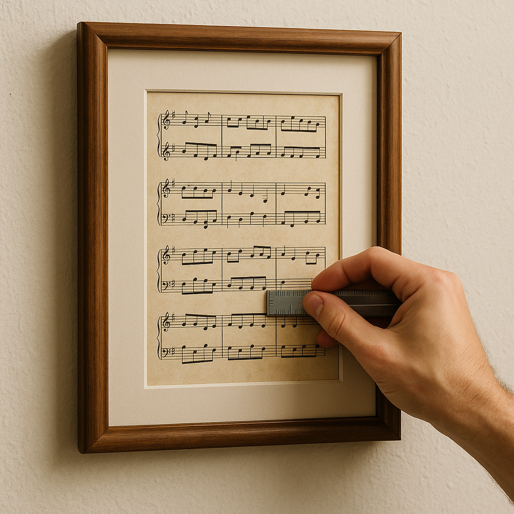
I love the look of vintage sheet music and old book pages, but I’ve also seen the version that looks like you ran out of money at the poster store. The difference is in three unglamorous choices: paper condition, matting, and repetition.
For paper, I don’t buy anything that smells like a basement. That scent does not magically go away once it’s in a frame, and you are going to notice it every time the sun warms the glass. I flip pages and look for foxing spots, water ripples, and brittle edges. A little patina is fine. Crunchy corners that flake when you touch them are a no for me, because you’ll fight it while mounting and it will look ragged, not charming. I also avoid pages that are very darkened at the edges unless I’m doing a full set that way. One page with heavy aging next to two cleaner ones just looks accidental.
Then I treat the page like a print. That means a mat, even a simple one. If the thrift store frame already has a mat, great. If not, I have gotten surprisingly far with pre-cut mats from Michael’s when they run a sale, because the clean border is what makes the whole thing feel intentional. I center the page with a ruler, not my eyeballs, and I attach it with photo corners or a tiny roll of archival tape on the back. I am not gluing priceless ephemera here, but I also don’t want the page sliding down inside the frame two weeks later.
Repetition is the last piece. One framed page is a cute accent. Three to six, all the same size, turns into a moment. My favorite set is a run of sheet music pages where the notes create a consistent texture across the wall, like a pattern. If you want it to feel even more collected, mix in one curveball: a small framed portrait from the same thrift trip, or an old postcard, or a tiny oil painting with a price sticker still hiding on the back. Keep the frames consistent, keep the spacing consistent, and suddenly your hallway looks like you meant to do it instead of improvising on a Saturday night.