
Three color schemes I use when I want outfits to mix cleanly without looking like I planned my whole life around them.
Greige + black + one metal you can commit to
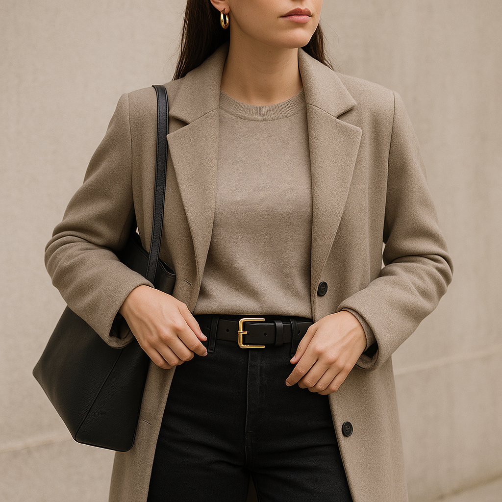
Greige is my quiet workhorse color because it behaves like a neutral but looks like you made a choice. The trick is not buying ten slightly different greiges and hoping they play nice. I pick one lane: either a warmer mushroom-taupe or a cooler stone-gray, then I keep black consistent (true black, not washed charcoal). From there, I lock in one metal and stop negotiating with myself at 7:40 a.m. If my hardware is gold, I want a gold buckle, gold hoops, and maybe one gold button detail on a cardigan. If it is silver, same deal. Mixing metals can look cool, but it makes a minimalist closet feel busier than it is, and the whole point here is a formula you can grab without thinking.
This scheme shows up in very specific pieces that are easy to find without paying designer prices: a greige ribbed tee, a greige merino crewneck, black straight-leg jeans, and a black belt with a simple buckle. Shoes are where it clicks. Black leather loafers or black sneakers (Adidas Sambas, New Balance 530s, whatever you actually wear) keep the bottom half clean, and a greige coat or trench makes even leggings look like an outfit. If I want the look to feel less office-y, I swap the black for faded black denim and keep the greige on top. Same palette, different mood.
One nitpicky thing that matters: watch the undertone on your bag. A warm camel bag can fight a cool greige and make the whole thing look accidental, like you grabbed someone else’s tote by mistake. A black bag, a stone bag, or a bag that matches your chosen metal hardware makes this combo feel smooth. When I get dressed in this range, I can change one thing (sunglasses, earrings, lip color) and still look put together, which is basically what I want from an outfit formula on a regular Tuesday.
Navy + optic white: the crisp combo that never looks loud
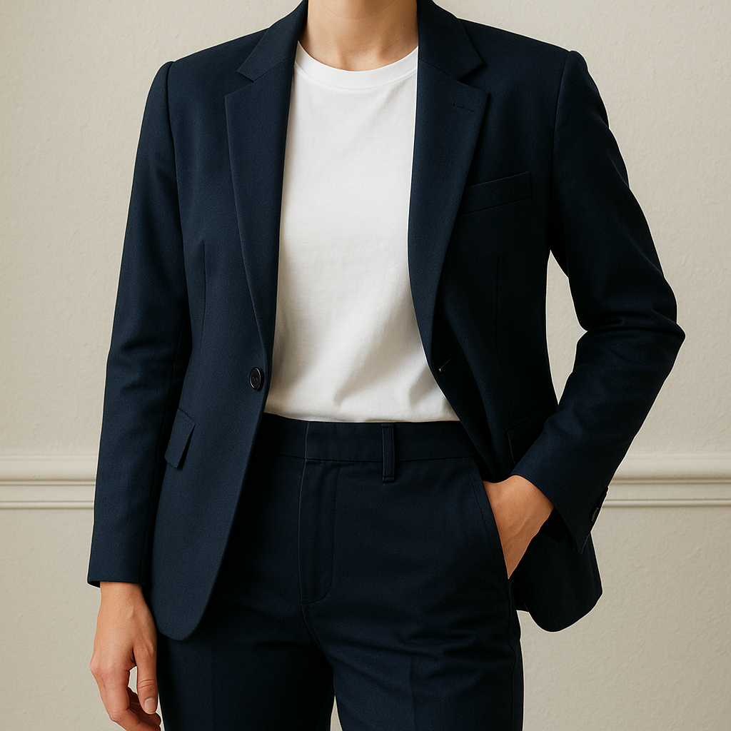
If you like clean outfits but black feels a little intense on you (or it photographs like a void), navy is the easiest switch. I treat navy as my dark base and optic white as the contrast. Not cream, not heather, not off-white that is sort of fin. Optic white, because it snaps. It makes navy look expensive even when your shirt came from Old Navy and your pants are from Uniqlo. The simplest version is a navy trouser or dark-wash, nearly-navy jean with a crisp white tee, then one structured layer: a navy blazer, a navy cardigan, or a striped Breton top if you want a little pattern without leaving the minimalist lane.
Here is the part people skip and then wonder why the outfit looks tired: whites have to be replaced more often than your darks. I keep one newer white tee for “I need to look like I tried” days, and the older ones become sleep shirts or gym shirts. When your white is dingy, the whole navy-and-white thing reads nautical in the wrong way. I am not precious about it, I just accept that white tees are a consumable. I like tees with a tighter neck and a slightly heavier knit because they stay crisp longer and do not collapse under a blazer collar.
On shoes, this scheme is forgiving. White sneakers are the obvious choice, but navy and white also look sharp with tan loafers, brown sandals, or even a metallic flat if you kept your jewelry metal consistent. For bags, I like navy, black, or a natural canvas tote with navy trim (J.Crew and LL Bean do this a lot). If you want one extra color, make it small and controlled: a red lip, a burgundy nail, or a single bright scarf. Keep the rest boring on purpose.
I reach for this palette when I want to look fres without doing more. It works for travel days, meetings, and those summer evenings where you want sleeves but you do not want to look like you are hiding from fun. Navy does not shout. It just shows up and behaves.
Cream + chocolate + denim that isn’t too blue
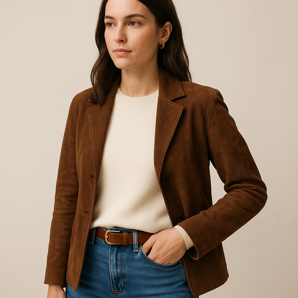
Cream and chocolate is the palette I use when I want softness without looking beige on beig. It reads grown-up, it works in every season, and it plays nicely with denim if you pick the right wash. The denim note matters. A super bright mid-blue jean can make cream look yellow and can make rich brown look like an accident. I like a darker indigo or a muted, vintage mid-wash, the kind that looks a little dusty rather than electric. If you have ever put on an ivory sweater and thought, “why do I look kind of sick,” it is usually the jean wash fighting the top.
I build this one around textures, because cream plus brown can look flat if everything is smooth. A cream knit, a brown leather belt, denim, and then something with a surface: a suede jacket, a nubby wool coat, a ribbed tank, a chunky cardigan. Footwear is where it gets really easy. Brown boots, taupe sneakers, or a simple clog in tan leather makes the whole thing feel cohesive. If you are a black-shoe person, you can still do it, but keep the bag dark too so the black does not look like a random afterthought at the bottom of an otherwise warm outfit.
Shopping note from too many fitting rooms: brown comes in a million wrong shades. I avoid anything that pulls orange unless the rest of my closet is warm. I also avoid browns that are so dark they are basically black, because then you lose the point of choosing brown in the first place. My goo browns look like espresso, cocoa, or walnut. They make cream look creamy, not dingy. This is one of the few times I will pay attention to labels, because ivor and crea are not the same on the body. Ivory can go a little yellow, cream is usually softer, and a true winter-white can look stark.
When I am using this as an outfit formula, I keep the jewelry simple and warm: gold hoops, a thin gold chain, or a watch with a brown strap. And I do not add a fourth color unless it is tiny, like tortoiseshell sunglasses. This palette is supposed to feel calm. If you keep it to cream, brown, and the right denim, it does.